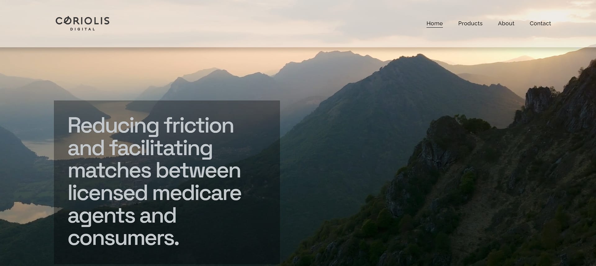


Coriolis Digital’s new website is on point!
Coriolis Digital’s new website is on point! Coriolis Digital, a leading Medicare marketing company, sought to revamp its website to better align with its brand identity and improve user engagement. Our team worked closely with them to create a cohesive and modern online presence that reflects their expertise and mission.
Key Improvements Implemented:
- Consistent Color Scheme: We unified the site’s color scheme across all tabs, removing the silver color variation that appeared on scroll. The hero image’s white and off-white tones now flow seamlessly throughout the site.
- Refined Branding: The “Why Coriolis” section was updated to clearly communicate their value proposition—over a decade of Medicare marketing experience aimed at reducing friction between consumers and agents while lowering acquisition costs.
- Metrics Highlighted: We replaced the “Inside our World” section with a “By the Numbers” feature, showcasing Coriolis Digital’s impressive performance metrics, such as:
- 100k+ customer interactions
- 5,500 applications submitted since April 2024
- 0 compliance issues
- 1 million minutes spent engaging with seniors
- Product-Centric Focus: The “Services” section was rebranded to “Products,” each represented by a dedicated box with clear descriptions:
- Leads: Premium quality data leads via a real-time auction marketplace
- Calls: Consumer-initiated inbound and warm transfer calls
- Clicks: Highly-targeted consumers searching for relevant products and services online
- Retention: Real-time identification of customers returning to the market
- Simplified Layout: Customer testimonials were temporarily removed to streamline the site, and we ensured the display of rotating trademarked logos for key partners, such as United Healthcare, BCBS, and Humana, followed legal guidelines.
- Improved Contact Section: The contact information, including address, email, and LinkedIn profile, was prominently updated to make connecting with Coriolis Digital effortless.
Task
Tasked with creating a compelling and modern site for a marketing company. Sleek and minimal was the goal.

